
I had heard about the Hinglish project back in June when Sindhu shared the link to their website on her status. I had since forgotten about it, only to be reminded of it some time ago when an Incredible India! video featuring the project was shared by many people on Facebook. The video has over 70000 views now. A few people even pinged me with the link and suggested that I do a Linguistrix post on it. So well, here we go.
First, have a look at the video:
The Hinglish project, by their own admission, worked with the aim of making Hindi characters ‘less intimidating’. In order to tell the phonetic sound of a Hindi character, all that a foreigner needed to do was to look at the English letter superimposed on it. Prima facie, this appears to be a good idea, but the more I think about it, the more difficult I find it to actually think of a practical application for the Hinglish Project.
The basic premise of this project is that it has come up with a Hinglish font that superimposes, on a Devanagari character, an English character whose pronunciation matches that of the Devanagari one closely. But, that’s also where the problems begin. First, the direction of transliteration seems to be reversed. The whole point of the Hinglish project is to make foreigners read Hindi, whereas the font they have developed maps 26 English characters to their approximate Hindi counterparts. Have a look at the alphabet of the Hinglish font:
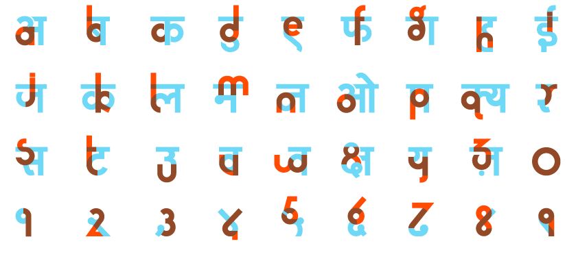
The Hinglish Alphabet
Since this alphabet covers only 23 out of the roughly 47 Devanagari characters (I am counting 11 vowels, 33 core consonants and 3 conjuncts), that’s half the script left illegible anyhow. But that’s still not as big an issue as the fact that this effectively provides a Hindi map of the English alphabet, rather than the other way round. I could imagine it being at least partly useful to someone who wanted to learn the English script. But I don’t see how it helps English speakers read Hindi. Surprisingly, almost all the examples on the website of this font put to actual use are English words or sentences written using this font, which makes no sense, because the purpose of the font is to let foreigners read Hindi words written in Devanagari. One would expect loads of examples of Hindi signboards written with the Hinglish font, but there aren’t any, which isn’t very surprising when you consider the fact that the font isn’t even equipped for that purpose.

The corresponding Devanagari letters form gibberish
The only Hindi word I found written was this one:

It is a different matter how someone could go from the letters G and I to the intended pronunciation for गई. That’s because this font completely ignores vowels. The obvious reason for this is that an alphabet like that of English has been mapped to an abugida script like that of Hindi. But by completely ignoring the existence of vowels in the script, the Hinglish project, even if it works, would just give the reader an unpronounceable sequence of English letters.
Even if they were able to pronounce them, they would obviously not understand anything, since they’d be reading Hindi, but I am ignoring that point here since I assume that this font is aimed at being used for signboards and the like where you’d mostly find proper nouns.
The next issue of course is that of readability. The 2 colour format means that the text would, apart from the gibberish English characters, be difficult to read even in Hindi, and would need special techniques to generate. This renders is rather impractical for actual signboards. In any case, it’s not a typeface that I would want to see on all signboards across India.
There are other possible uses of the Hinglish font, though. It could be used in phrasebooks or similar material to help foreigners learn the Devanagari script. But I find it to be of limited utility, considering that the English letters have been force fit in the case of most Devanagari characters, and would be hard to remember as mnemonic aids. More importantly, a book that actually aims at teaching someone the Devanagari script would have to use a more thorough approach that doesn’t ignore half the alphabet at the outset.
There’s another useful possibility. Instead of forcefully superimposing two scripts on each other, thus creating misleading associations, it would be pertinent to use something like the Japanese furigana. As Wikipedia explains, Furigana is a Japanese reading aid, consisting of smaller kana, or syllabic characters, printed next to a kanji (ideographic character) or other character to indicate its pronunciation.

In the above image, the small text at the top indicates the actual pronunciation of the Kanji characters given at the bottom. Something similar could be tried for Hindi, and with considerably better results. Something like:
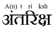
If someone were to read this, they would get a reasonable pronunciation of my name, and if they saw a few such examples, they would slowly learn to pick up features such as vowel marks and nasal markers.
Of course, the media buzz that this project gives will partially achieve the aim of the project. From what I’ve read, it’s won a few awards too. But, from a linguistic point of view, while the Hinglish project seems to be well-intentioned, it falls short by a considerable amount in actually solving the problems it identifies.